Фото Гвіневери Ван Сінус
Вступ: Що таке композиція?
Це сценарій з уроку для фотографів про правила композиції курсу Основи фотографії. Курс I.
Сьогодні ми поговоримо про науку композиції. Композиція відповідає на найбільший виклик фотографії. Реальність тепла, ароматна, ніжна та чарівна. Коли ми натискаємо кнопку затвора, вона перетворюється на плоску поверхню плям. Ми хочемо, щоб глядач все ще бачив реальність. Наші глядачі — тверезі дорослі; їх нелегко обдурити. Але вони дивляться на плями та вірять, що це реальність. Вони сміються, плачуть і хочуть платити гроші. Якщо це трапляється, ваша композиція була переконливою. Композиція — це правила розмови з глядачем. Реальність стає плоскою, але ми все одно хочемо впливу. Пам’ятайте, що ми перші глядачі власних фотографій.
Перевірка домашнього завдання: Лінзи та фон
Давайте зараз розглянемо ваші домашні завдання. Ці завдання були зосереджені на ширококутних та портретних об'єктивах.
Подивіться на це зображення; студент використав трикутник експозиції. Це добре, але нам потрібен тип об'єктива, який використовувався. Цей гарний об'єкт, ймовірно, використовував ширококутний об'єктив. Можливо, фокусна відстань була 35 мм. На наступному фото, ймовірно, використовувався портретний об'єктив. Будь ласка, виправте мене, якщо я помиляюся.
Студент каже, що ширококутний об'єктив було використано пізніше. Ширококутні об'єктиви можуть спотворювати об'єкт зйомки. Подивіться на збільшені вуха на першому фото. Щоб дійсно показати спотворення, підійдіть дуже близько. Підійдіть до моделі якомога ближче, наскільки дозволяє об'єктив. Тоді ви побачите сильні перспективні спотворення.
Уявіть собі приклад камери мобільного телефону. Зйомка зверху дає велику голову та маленьке тіло. Зйомка знизу дає великі руки та маленьку голову. Ця зміна пропорцій і є спотворенням. Кожне завдання має нагадувати нам про важливу ідею.
Початківці часто роблять шість основних помилок. Одна помилка — використання неправильного об’єктива для цього жанру. Інша — ігнорування розташування на задньому плані. Фон має підкреслювати вашу модель. Уявіть собі розташування як сукню моделі. Гарна сукня підкреслює людину, яка її носить.
Технічне завдання вимагало швидких ширококутних та портретних знімків. Але чи було це місце ідеальним? Ні. Мені не подобається «сміттєве небо» без текстури. Також там стирчить якась дивна труба. Спочатку потрібно знайти гарне місце. Після цього уроку ви зрозумієте, що таке «гарне місце».
Ми повинні свідомо вибирати правильний об'єктив. Використовуйте онлайн-симулятори, щоб побачити ефекти об'єктива. Сем Ян — один із виробників об'єктивів, який має симулятор. Він показує, як фокусна відстань та діафрагма змінюють зображення. Фокусна відстань (діафрагма та міліметри) є ключовою. Мобільні телефони мають крихітні фокусні відстані, можливо, 5 мм. Чому на фотографіях з мобільного телефону не видно сильних спотворень? Програмне забезпечення автоматично виправляє ці спотворення об'єктива.
Широка діафрагма (наприклад, f/1.2) створює художнє розмиття (боке). Це розмиття приховує відволікаючі фони. Якщо місце зйомки цікаве, закрийте діафрагму. Закриття діафрагми робить видимим хороший фон. Поекспериментуйте з цими налаштуваннями вдома.
Якщо обличчя дівчини спотворене, це може бути більш неприємним. Хлопців часто менше турбує спотворення. Вони виглядають впевненими та щасливими в будь-якому випадку.
Локація є первинною. Тренуйте композиційний м'яз.
Завжди спочатку дивіться на місце позаду об'єкта зйомки. Це дуже важлива композиційна поведінка. Цей «м'яз» потрібно постійно тренувати. Початківцям зазвичай бракує цього вирішального м'яза. Досвідчені фотографи вже дивляться за модель. Вони перевіряють, чи не ростуть «роги» з голови моделі.
У домашньому завданні, здається, проростає фоновий елемент. Ця відволікаюча увага — явна помилка новачка. Я радий, що ви зробили цю помилку. Тепер вся група вчиться, як її виправити. Не приховуйте своїх помилок; покажіть їх. Мій наставник з фотографії сказав, що помилки — це золоті тарілки. Вони ведуть фотографа до майстерності.
Шість способів вирішення проблеми фонового безладу:
- Змініть кут: знімайте зліва, справа або з центру. Симетричне обличчя добре виглядає в центрі. Змініть кут, щоб «роги» зникли.
- Змініть місце: Відведіть людину в інше місце. Це найпростіше рішення.
- Широка діафрагма: Значно відкрийте діафрагму. Це створить сильну, малу глибину різкості. Купіть світлосильний об'єктив, наприклад, Sigma 56mm f/1.4. Об'єктиви Sigma часто набагато дешевші за фірмові об'єктиви.
- Видаліть зайве: Якщо можливо, фізично видаліть відволікаючий фоновий шум.
- Обрізання фону: Підійдіть ближче до моделі. Обріжте фон за допомогою самої рамки.
- Післяобробка: Відредагуйте фотографію за допомогою програмного забезпечення. Google Фото має інструменти обрізання. Це дозволяє неруйнівне редагування.
Фокусна відстань та стиснення перспективи
Подивіться на цей приклад: об'єктиви 18 мм проти 135 мм. Обличчя майже однакові. Різниця полягає в фоновому оточенні. Фон парку чітко видно на 18 мм. На 135 мм фон стиснутий. Модель щільно притягнута до нього.
Великі фокусні відстані (135 мм, 200 мм) стискають сцену. Вони наближають віддалені фони до об'єкта зйомки. Це дуже цікавий прийом.
Приклад: Драма Бенсе Мате
Бенсман використав для цього знімка об'єктив 200 мм. Здається, що змія та колібрі б'ються. Але насправді вони не бачать одне одного. Довгофокусний об'єктив стиснув передню та задню площини. Він закрив діафрагму (f/8 або f/11) для глибини різкості. Це створює конфлікт та драму.
Використання ширококутного зображення для портретів
Ви можете зробити гарний портрет за допомогою ширококутного об'єктива. Правило перше: якщо модель гарна, ніщо її не псує. Якщо людина впевнена в собі, підійде будь-який об'єктив. Навіть мобільний телефон, крупний план, підійде. Можливо, у вас вийде великий ніс, але що з того.
Якщо розташувати модель по центру та відступити назад, навіть ширококутний об'єктив 18 мм демонструє незначні спотворення. Спотворення зазвичай найбільше по кутах.
Ширококутний об'єктив має переваги, якщо фон хороший. Він діє як харизматична «сукня» для моделі. Якщо оточення нудне, використовуйте телеоб'єктиви. Телеоб'єктиви сильно розмивають фон.
Кожен об'єктив має переваги та недоліки. Широкий кут охоплює багато навколишнього середовища. Це може бути корисним для моделі. Широкий кут також може спотворювати ідеальні людські пропорції. Художники епохи Відродження знайшли математику в людському тілі. Голова сім разів більше, ніж довжина тіла. Пупок – це центральна точка. Ми базуємось на дуже точній математиці.
Зазвичай уникайте ширококутної зйомки для людей. Великі ноги та маленькі голови означають відсутність грошей. Модель може навіть зробити вам зауваження.
Креативне порушення правил
Однак, багато ситуацій вимагають широкого ракурсу. Це дає незвичайну картину. Композиційне правило 1: Існує багато правил. Ми повинні навчитися творчо порушувати всі правила. Немає справжніх правил, є лише принципи. Принципи зазвичай допомагають, але порушуйте їх для отримання незвичайних результатів.
Подивіться на роботи Надін Евер. Її моделі – впевнені в собі люди. Вона потужно їх спотворює. Подивіться на величезну ногу на цьому зображенні. Подивіться на гігантську руку на наступному. Якщо це реклама рукавички, то їй це вдалося. На іншому зображенні зображена «гігантська мати», яка підтримує її. Інша людина стає частиною оточення.
Модна фотографія повинна шокувати глядача. Вона використовує ширококутні об'єктиви всупереч їхньому типовому призначенню. Композиційне правило: Відрізнися або помри . Чому люди повинні дивитися на ваші фотографії?. Якщо ви знімаєте, як усі інші, вони не дивитимуться. Подивіться на зображення з об'єктивом «риб'яче око» (8 мм). Вони схожі на милих мультяшних персонажів. Нік Найт також дивно використовує широкий кут. Дівчина схожа на інопланетянина.
Предмети та тварини
Об'єктив 55 мм – це цілком нормально. Звичайні або стандартні об'єктиви бачать як наше око. Спотворення в першу чергу впливає на людей. Коли ми бачимо непропорційну людину, ми відчуваємо жаль. Ми можемо припустити хворобу або важке дитинство. Але якщо ви фотографуєте кота, собаку чи ляльку. Нам байдуже, чи спотворена вона. Подивіться на це фото кота на мобільному телефоні (5 мм). Великий хвіст, маленька голова, але виглядає адекватно.
У попередньому завданні було запропоновано порівняти об'єкти. Це корисно, якщо ви не можете знайти модель. Але ширококутні об'єктиви знімають неживі об'єкти нормально. Архітектура, натюрморти та природа підійдуть. Ніхто не помічає спотворення об'єктива на цих об'єктах.
Обрізка для створення ефекту повітря та естетики
Модель гарна на обох фотографіях. На другій фон спокійніший. На першій я б обрізав "сміттєве небо". Ви можете замінити небо за допомогою Photoshop.
Вам слід звернути увагу на розташування. Цій моделі бракує "повітря" навколо неї. Якщо я обріжу її до квадрата, вона виглядає краще. Квадратний формат дуже стабільний. Він дає моделі відчуття простору, щоб дихати. Багато початківців кадрують занадто щільно. Дайте моделі простір; ми любимо повітря навколо об'єкта.
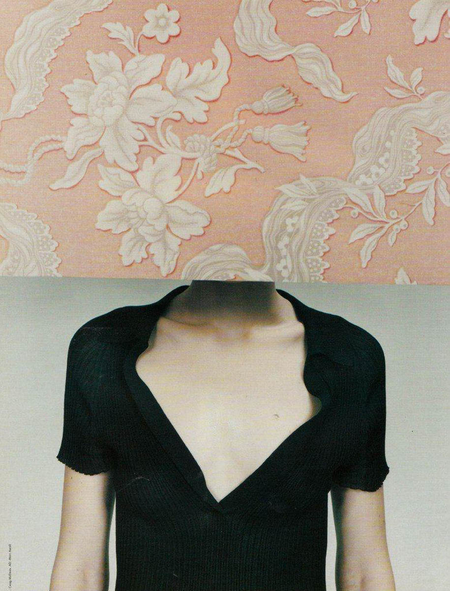
Подивіться на цю цікаву композицію. Вона стосується не лише очей та посмішок. Ніжна, беззахисна шия може розповісти історію. Це стиль Рінко Каваучі. Портрет зображує людину сприятливо. Ми хочемо зустрітися з нею та привітатися. Навіть якщо людина розмита, ми її впізнаємо. Цей елемент все одно привертає увагу. Використовуйте цю увагу з розумом.
Якщо використовуються об'єктиви 55 мм та 89 мм, різниця не буде помітною на об'єктах. Спробуйте порівняти фотографію, зроблену ширококутним мобільним телефоном (5 мм). Порівняйте її зі знімком, зробленим 55 мм або 89 мм. Спробуйте зафіксувати різницю.
Твір: Принципи
Зараз ми переходимо до технік композиції. Я вивчаю близько 300 технік композиції. Сьогодні ми розглянемо приблизно 25-30 корисних технік.
Техніки – це вибір, який впливає на зображення. Ви вирішуєте, що виділити об'єктивом. Мета – бути більш виразним. Нам потрібне візуальне ствердження, яке підтримується композицією.
Лінзи як композиційні інструменти
Арнольд Ньюман сказав: Не знімайте портрети портретними об'єктивами. Портретні об'єктиви виключають оточення. Без контексту, людина маніяк чи композитор? Якщо ви бачите музичні інструменти, вона, ймовірно, не маніяк. Це називається екологічною фотографією. Місце зйомки характеризує модель. Широкий кут потрібен, якщо оточення виразне.
Фокусна відстань – це свідомий інструмент композиції. Ми використовуємо різні фокусні відстані для різних зображень.
Природа реальності та порядку
Композиція передбачає передбачення та впорядкування реальності. Реальність часто буває негарною або негідною. Краса проявляється в очах фотографа. Якщо десять людей знімають одне й те саме місце, лише двоє можуть зробити гарне зображення. Вони побачили порядок, інтуїтивно чи свідомо.
Ви всі вже композитори. Ваш вибір дизайну інтер'єру – це композиційні рішення. Ресторани та одяг, які ви обираєте, – це композиція.
Сім нот композиції
Існує сім способів впливу на глядача. Уявіть собі сім кольорів, сім чудес, сім нот. Ми впливаємо на глядачів через: простір , лінії , фігури , форму , текстуру , світло/тінь та колір . Сьогодні ми зосередимося на просторі та герої . Повний курс композиції охоплює набагато більше.
Метафора більярду
Правила композиції не є жорсткими. Це як гра в більярд. Не завжди можна вдарити по білій кулі під кутом 45 градусів. Різні ситуації вимагають різних технік. Ми повинні швидко вибрати правильну композиційну палітру.
Сила композиційного вибору
Розглянемо цей майстер-клас з танців. У всіх були чудові камери, світло, локація та моделі. Але деякі студенти отримали приголомшливі кадри. Інші ж отримали комічні, кумедні фотографії. Позування було однаковим на обох кадрах.
Яка різниця між цими знімками? Два ключові речі: кут і фокусна відстань . У гарному знімку було використано телеоб'єктив (70 мм). Фотограф відійшов далеко назад, щоб зафіксувати всю сцену. У кумедному знімку було використано ширококутний об'єктив. Широкий кут спричиняв спотворення та додав шум.
Технічний вибір залежить від композиції
Усі технічні налаштування – це композиційний вибір. Трикутник експозиції є частиною композиції. Коротка витримка заморожує рух. Довга витримка повністю розмиває об’єкт. Тривала експозиція може створювати художні ефекти. Діафрагма, витримка, ISO та зернистість додають художності. Запитайте себе: які художні ефекти виникають завдяки цьому налаштуванню?
Запитання глядача
Глядач запитує: Хто , Де та Яка емоція? Усі 300 композиційних технік поміщаються у три валізи.
- Сцена/Фон (Де): 100 технік щодо сцени кадру.
- Герой (Хто): 100 технік, щоб виділити героя.
- Емоції/Естетика (Що): 100 технік для настрою та краси.
Метафора театральної сцени
Уявіть собі кадр як театральну сцену. Ви вже бачили ці концепції в театрі. Я просто нагадую вам, що це навмисний вибір.
Формати
Рамка може мати різні формати. Вертикальний формат зазвичай використовується для людей (портрет). Горизонтальний формат зазвичай використовується для неживих об'єктів (природа, архітектура). Це нечітке правило, як показало домашнє завдання.
Формат 16:9 є динамічним та панорамним. Ми повинні рухати очима ліворуч і праворуч. Цей рух робить фотографію динамічною. Динаміка чи статика передають усі емоції.
Квадратний формат
Пам'ятаєте черепашок-ніндзя: Донателло, Мікеланджело, Леонардо та Рафаеля? Вони були геніями епохи Відродження. Вони вважали, що квадрат — це божественна форма .
Якщо об’єкт або місце зйомки погані, ви можете обрізати зображення до квадрата. Потім перетворити його на чорно-біле. Це частково жарт, але це працює. Квадратний формат справді підвищує естетику зображення.
Нейроестетика вивчає, що люди вважають красивим і чому. Показ людям квадрата викликає вивільнення ендорфіну. Це хімічна речовина задоволення. Використовуйте квадрат, щоб покращити естетику вашого зображення.
Instagram навмисно почав з квадратних фотографій. Ви фотографуєте все, що є квадратом, і отримуєте лайки. Відомі фотографи використовували квадратні камери. Hasselblad та Rolleiflex продавали плівкові камери формату 6x6 см. Фотографи, такі як Франческа Вудман, постійно використовували квадрат. Сучасний фотограф Майкл Кенна використовує квадрати. Це свідоме композиційне рішення.
Свідомі проти інтуїтивних рішень
Досвідчені фотографи роблять свідомий вибір. Вони синтезують кілька правил для створення чудових фотографій. Гарні фотографії часто містять цілий букет технік. Ось чому фотографів називають фотохудожниками. Художники роблять свідомий синтез. Вони додають елементи на полотно, щоб зробити його цікавим. Ви можете перетворити просте дерево на абстрактну фею.
Розміщення героя: центр проти третіх
Ми — хижаки; наші очі спрямовані спереду. Ми фокусуємося на цілі, ігноруючи перешкоди. Розміщення героя в центрі для нас природне. На всіх ваших домашніх знімках герой був у центрі. Об'єктив найкраще фокусується в центрі. Спотворення мінімальне в центрі.
Правило третин
Розділіть рамку на три вертикальні частини. Розділіть її на три горизонтальні частини. Перетини – це точки напруження або активні точки. Правило третин – це лише один із 300 прийомів. Його вивчають спочатку, тому що новачки надмірно використовують центр.
У фільмі ви побачите поєднання центральної та третіх частин. Чому саме поєднання? Це пов'язано з емоціями персонажа.
- Центр пов'язаний зі статичним, рефлексивним або спокійним настроєм.
- Терці стосуються динамічної дії або комунікації .
Персонаж може бачити сон, що є динамічним. Залишення простору в кадрі дозволяє його «мріям». Цей простір також може бути призначений для духових інструментів чи музики.
Чому третини важливі
Правило третин – найпростіший спосіб. Воно допомагає збалансувати незбалансоване зображення. Центроване зображення має природний баланс. Зображення з об'єктом зйомки ліворуч здається незбалансованим. Точки правила третин діють як візуальні опори. Вони запобігають падінню зображення. Статичний герой все ще може бути в третинах. Це працює, якщо важкий предмет врівноважує його з іншого боку. Третини допомагають збалансувати незбалансовану композицію .
Застосування третин
У портретному живописі очі часто розміщують на верхній активній лінії . Голова або одне око потрапляє на точку напруги. Якщо портрет обрізаний близько.
У пейзажній зйомці правила інші. Якщо фоном є головний герой (наприклад, могутні дуби або бурхливе небо), дві третини кадру присвячені цьому об'єкту. Ансель Адамс часто розміщує горизонт на нижній або верхній активній лінії. Він залишає дві третини для своїх основних об'єктів – скель.
Пам’ятайте: правил композиції не існує . Наприклад, Майкл Кенна порушує правило горизонту. Він розміщує лінію горизонту точно по центру.
Букет технік Майкла Кенни (6 балів):
- Мінімалістичні/спрощені локації: лише від одного до трьох згрупованих об'єктів.
- Квадратний формат .
- Центральна лінія горизонту: створює стабільність.
- Чорно-білий (монохромний) .
- Тривала витримка: часто знімається в сутінках (наприклад, 5 секунд).
- Ефекти тривалої витримки: вода розмивається, перетворюючись на желе; човни тремтять.
Кенна свідомо спрямовує свою роботу в бік недокументального мистецтва. Він хоче, щоб звичайні предмети натякали на глибший сенс.
Сцена без героя
Фон або сцена можуть бути виразними самі по собі. Ось емпіричне правило: якщо місце достатньо гарне для фотографування як гарного пейзажу, то ви б роздрукували його та повісили вдома, тоді це гарне місце для портрета. Воно служить чудовим гардеробом для вашої моделі. Воно перетворює Попелюшку на принцесу.
Наш мозок гостро реагує на прості композиційні сигнали. Симетрія, ритм, повторення, проста геометрія. Горизонтальні, вертикальні, діагональні та S-подібні лінії. S-подібні лінії – це те, що ми отримуємо від природи.
Ці елементи (симетрія, ритм тощо) вивільняють ендорфіни. Ми успадкували це від наших предків.
Приклад риби-фугу
Самець риби-фугу хоче міцної сім'ї. Він тиждень створює гарну, симетричну мандалу. Це мистецтво, але шторм його зруйнує. Він починає спочатку. Якщо йому це вдається, він запрошує самку. Вона обирає його, бо його мозок може створити це мистецтво. Якщо він може це зробити, він може охороняти їхню ікру. Природа використовує творчу активність як ознаку здоров'я. Навіть риби цінують симетрію несвідомо. Ми можемо свідомо використовувати симетрію та ритм.
Властивості простору
Двісті років тому простір полотна міг бути візуально складним. Картина Карла Брюллова « Останній день Помпеїв » величезна. Це 24 квадратні метри полотна. У той час люди були візуально спраглі. Така детальна робота захоплювала. Люди обговорювали її годинами.
Сьогодні ми маємо забагато візуальної інформації. Трендом 21 століття є спрощення та мінімалізм .
В онлайн-галереях мистецтва представлені прості сучасні фотографії. Часто лише кілька елементів та чистий фон.
Шість способів спростити каркас:
-
Додайте вільний простір: це змушує нас знаходити вдалі місця. Цей вільний простір також називають негативним простором , повітрям або ізоляцією . Мені особливо подобається японський термін МА . МА означає «велике ніщо, в якому відбувається все неважливе». Стародавні східні художники розуміли порожнечу. Лао-цзи казав, що ми цінуємо будівлю за її порожнечу. Ми цінуємо горщик за порожнечу всередині. Знання технік композиції змінює те, як ви бачите. Ваше сприйняття починає зосереджуватися на негативному просторі. Подивіться на картину Христа. Він зображений у третинах кадрів, оточений круглою порожнечею. Це привертає до нього увагу. Цей принцип змінює поведінку фотографа. Наш лектор шукає простоти біля океану. В океанах бракує будівель і дерев. Він знімає о 5 ранку, коли місце порожнє. Він отримує порожнечу, S-подібні лінії та пастельні кольори.
-
Боке (розмиття фону): Ось що ви робили на домашньому завданні. Розмиття фону допомагає очам сфокусуватися. Розмиття в русі (панорамування) також візуально цікаве.
-
Монохромний (чорно-білий): Цей метод видаляє колір. Чому видалення кольору підвищує естетику? Наш мозок дорогий; він споживає багато енергії. Для кольорового зору потрібно 16 центрів мозку. Вимкнення кольору зменшує зусилля мозку. Якщо ваша фотографія базується на кольорі (квіти, папуги), уникайте чорно-білого режиму. В іншому випадку чорно-білий режим спрощує та підсилює зображення. Ціанотипія – це ще одна монохромна техніка.
-
Туман, серпанок або темрява: це приховує складність та візуальне багатство. Туман трапляється рідко, що робить його естетично приємним. Туман створює таємницю та спонукає до здогадок. Туман і темрява можуть здаватися небезпечними. Але коли ми дивимося на мистецтво, ми в безпеці та насолоджуємося таємницею. У студії можна використовувати димову машину.
-
Світлотінь (Кіароскуро): Караваджо винайшов цю техніку. Його ідея була схожа на театральне освітлення. Потужний промінь світла слідує за героєм. Ми слідуємо за найяскравішою точкою. Ховаємо все зайве в тіні. Це вимагає спеціального вимірювання експозиції. Використовуйте точкове вимірювання . Камера вимірює лише найяскравішу точку. Алекс Вебб навмисно використовував цю техніку. Ви можете побачити цей ефект вдома вночі. Бічне світло підсвічує героя та приховує зайві елементи.
-
Спрощення до абстракції: Використовуйте критичне кадрування. Плоска зйомка: Знімайте критично зверху (як птах). Звичайні люди знімають на рівні очей. Плоска зйомка поширена у фотографії їжі та товарів. Вона робить звичайні речі незвичайними. Знімайте, як мураха: Знімайте з надзвичайно низьких ракурсів. Еліот Ервітт був відомий тим, що фотографував собак таким чином. Відрізни або помри . Критичне кадрування: Не знімайте всю будівлю. Зосередьтеся лише на лініях і текстурах. Це може спростити сцену до чистої геометрії. Ця техніка натхненна Марком Ротко. Критичне кадрування може виграти міжнародні нагороди. Студійний фон: Використовуйте простий фон, щоб ізолювати модель. Річард Аведон подорожував з великим білим фоном. Він фотографував звичайних, але водночас незвичайних американців.
Глибина та перспектива
Глядач очікує реалізму від фотографії. Він хоче зазирнути у вікно реальності. Ми надаємо йому цю реальність, використовуючи перспективу .
Лінійна перспектива була винайдена досить пізно (14 століття). Філіппо Брунеллескі зрозумів, що лінії сходяться на горизонті.
Тональна перспектива
Подивіться на картину Пітера Брейгеля «Падіння Ікара» . Ви ледве бачите ноги Ікара. Брейгель насміхався з Ікара за те, що той летів занадто високо. Герої — це селяни, які обробляють землю. Вони уособлюють чесноту «догляду за власним садом».
Давайте порівняємо передній план і фон.
- Передній план: Теплий, великий, різкий, контрастний .
- Фон: Холодний, дрібний, розмитий, ненасичений . Передня та задня площини повинні відрізнятися. Ця різниця створює ілюзію глибини.
Перспектива масштабу
Ай Вейвей використовує масштабну перспективу у своїй роботі. Ми бачимо палець, більший за людину. Його проєкт «Дослідження перспективи» має політичний характер. Він показує авторитетним особам палець. Він стверджує, що еліта більше не служить народу. Але для нас це показує масштабну перспективу.
Співвідношення фігури до поверхні: пошук героя
Ми повинні переконатися, що глядач миттєво зрозуміє героя. Якщо фотографія занадто перевантажена, вона не вдається (як у фільмі « Де Воллі »). Головний об'єкт має чітко відрізнятися від фону.
Масштаб (близькість)
Найпростіше рішення — підійти до героя ближче. Обрізання зображення ізолює героя. Сінді Шерман використала надзвичайно обрізання зображення.
Три божественні контрасти
Масштаб — не єдина відмінність. Пам’ятайте про три Божественні контрасти :
- Тональний контраст: знімайте світле проти темряви або темрява проти світлого.
- Колірний контраст: Знімайте теплі кольори на тлі холодних.
- Контраст текстури: Зйомка різких об'єктів на тлі розмитих зображень.
Якщо присутні всі три контрасти, фотографія виглядає професійно.
- Тональний: Світла модель на темному фоні.
- Колір: Теплий об'єкт (жовта сукня) на холодному фоні (зелене листя).
- Текстура: Різкий об'єкт на розмитому фоні (боке).
Фотограф Ієн Тейлор контролював гардероб та локацію. Контрасти були навмисними, а не випадковими.
Контраст текстур – це не просто боке. Фотографи новонароджених використовують шорсткі поверхні. Гладку дитину розміщують на шорсткому фоні. Цей контраст свідомо керують. Те саме роблять фешн-фотографи.
Приклад тонального контрасту
Біла повітряна кулька виділяється. Алекс Вебб використовує це: темна фігура на світлому фоні.
Приклад колірного контрасту
Який м'яч тут об'єкт? Червоний. Це тому, що він одного, непарного кольору. Алекс Вебб активно шукає яскраві кольорові плями на вулиці.
Обрамлення (фреймер у рамці)
Обрамлення – це простий і надійний спосіб виділити героя.
Відображення – потужний тип кадрування. Гельмут Ньютон, Вівіан Майєр та Алекс Вебб використовували дзеркала. Якщо Алекс Вебб бачить дзеркало, він зупиняється, щоб зробити знімок. Ви повинні створити кадр за допомогою дзеркала. Це обов'язковий крок для розвитку вашої фотографії. Шукайте вікна, арки або перголи з рослинами. Використовуйте власні руки, щоб обрамити об'єкт.
Висновок та завдання
Сьогодні ми розглянули багато важливих та ефективних ідей. Я буду задоволений, якщо ви запам'ятаєте ці п'ять правил:
- Спочатку зосередьтеся на фоні, а потім на герої. Тренуйте цей м’язовий рефлекс щодня.
- Відокремте героя від фону. Використайте три Божественні контрасти.
- Надайте герою повітря та балансу. Використайте правило третин.
- Використовуйте перспективу для імітації глибини різкості.
Ці принципи показані тому, що новачки зазвичай їх не використовують. Більш досвідчені студенти вже зосереджуються на цих речах.
Домашнє завдання:
Я очікую два креативні знімки від вашої талановитої групи.
- Герой у правилі третин: головний об'єкт має бути в третинах. Використайте на цьому зображенні Три Божественні Контрасти . Це означає яскраве проти темного, тепле проти холодного та різке проти розмитого.
- Герой з лінійною перспективою: Розмістіть свого героя на тлі лінійної перспективи. Ви легко знайдете лінійну перспективу в місті. Шукайте довгі проспекти, мости або довгі будівлі.
Дякую за вашу увагу. Сподіваюся, вам це було так само цікаво, як і мені. Я скоро завантажу запис. Ви знайдете нові ідеї, коли переглянете його пізніше. Ви можете знайти мене на Facebook для підтримки після курсу. До побачення, і дякую всім.